
Elements & Principles of Art: pattern, value, movement (art 100 section 10)

Carmen
Pattern, value and movement assignment didnt look easy at the beginning. It seems tough to me to get value in my paintings especially when I’m doing it with the paint colors because i normally dont get able to create different values of the same color. Its a hard job but looking on the pieces by the class I can say that everyone has done great.
The pieces I liked the most are by Eric and the elephant by Amanda. These two pieces have some difficult patterns that are drawn very neatly. About Eric’s painting I would say that first of all I liked the concept of drawing the skating boards. Because skating boards are normally very colorful and one has a good chance to add value to these colors. My suggestion for Eric would be that he could add some lighter colors to make the boards pop up a little more.
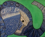
Amanda has chosen a wonderful and a different concept of drawing an elephant. As I am from South Asia, as I have already mentioned in the class, we normally see elephants painted like this in real to make them more attractable because elephant’s color and skin is very dull and unattractive so we have painted elephants in south Asia in amusement parks and zoo. When I first looked at it, the drawing reminded me of those elephants. the circles drawn at the head of the elephant are really nice and eye catching.
In Adam’s piece I liked the different colors of the sky and this is probably the best way to value the colors of the sky. I really like the idea and the colors drag you towards the top right corner.
The star in Amanda T’s painting pops out of the page and yellow is such a happy color that it always attracts you towards itself. There is a neatly and nicely drawn tree by sami, i really liked it and the patterns in it. sami has really done justice with the pattern thing that is drawing many of them and drawing it in such a way that they show connection to each other. The two drawings of boxes by Malenie and Marin looks the same when you glance at them but by seeing carefully I noticed that two are totally different. One has darker color starting in the middle where in the other its at the edges. There are many other drawings in which I can see a lot of patterns and value like the drawings by Youmna, Sara, zak and Hannah.
One thing that I would like to mention is that most of have mostly focused on the patterns but less attention is paid on creating value , same is the case with my painting “The bus” . The idea behind my painting was the colorful buses we have back home in Pakistan.
While doing my piece I had the concept of my tour to california that I was going to experience with in couple of weeks of this class. I tried to show happiness, colors, freedom and excitement of travelling I always feel while going on a trip.
Farhan A.
-
- Nicole B.
-
- Hannah
-

- Eric
-

- Kam
-

- Kacee U.
-

- Cearra
-

- Jay R.
-

- Melanie A.
-
- Abby
-

- Youmna
-

- Sami H.
-

- Ryan P.
-

- Emily P.
-

- Carrie
-

- Riley
-

- Adam

-

- Farhan A.
-
- Marin B.
-
- Amanda H.
-

- Zak A.
-

- Rachel R.
-

- Carmen
-

- Kaley
-

- Amanda T.
-

- Lauren
-

- Sara K.
-

- Ryan P.

Art 100-10
Elements and principles of art
When receiving the pattern, value and movement assignment I was very lire about how I would go about this. Seeing all these pictures, make me realize that everyone has a little different, yet unique idea. This was what made each painting so personal.
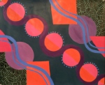
I’ll start with the painting that catches my eye every time I look at my individual class, and that is the orange purple and green picture. This artist has circles going diagonally down the page, with what looks like ribbon around each orange circle. Then he or she has a row of purple circle and orange square and what looks like a pinkish triangle. Then at opposite corners there is a green and black pattern that is simple but caught my eye. Now that I am describing this photo I now see that each circle across the picture is pink and orange with every one switching directions. This photo catches my eye because it flows together nicely and follows somewhat of a pattern but let it also includes a pattern with the colors and then adding the blue waves, giving this picture depth and precision. I love this painting
The next painting that works well is the blue white and black one, with the two people holding hands and the heart in the middle. This artist took for very powerful pattern and used them around one simple picture. The picture is a little off center, and this could be what the artist wanted but it might have worked better if it was right in the middle and the heart was more defined. But otherwise there is a lot of depth and movement in this photo. I liked how this person kept the same sort of colors throughout the photo to bring it all together. But yet each pattern has its own depth and each one sticks out a little different. Maybe this artist could have made the people have a few gray shadows to accent them a little more and then this picture would really work.
My next favorite is between the elephant and the bonsai tree. The elephant is very unique and different but the bonsai tree is even color. The way this artist used a full range of values from dark to light from the tree to the end of the picture makes the tree pop. Then within the tree he or see used many different pattern that flowed together almost looking like the grains in a tree. The different pattern are unique but also work very well together in this photo. I also liked how they kept color in this photo with the different color greens I am really picturing this photo is some type of famous gallery. Very nice painting, this person is well talented and has a skilled eye for this kind of drawing.
The photo that uses different patterns but doesn’t look complete would be the peace sign with the fingers and the heart. I feel like there needs to be something more within this photo. This artist has a good idea, she kind of did something similar to the person with the two people holding hands but I wasn’t to found of the black and white. The patterns are cool and different, but they all look the same when in black and white. Maybe if this person would have used different values of pink and purple it would have made the patterns pop more. The fingers are great with shadowing and depth, but the outside patterns could just use a little bite of color.
The peacock one with the large feathers on top getting smaller and smaller almost looks like an actual photo of a peacock. The way this artist made the feathers on top large and with lots of detail and then as they got smaller there was more and they kind of all worked together. This one is different to me because this artist used only one pattern to create this picture. It has lots of detail and the colors go excellent together. After I examine it more and more I admire the details of this picture how this person used value within each feather. Made each one a little different but in the end they all look the same and flow together smoothly.
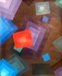
There are two photos that both use rectangles and squares at different sizes and angels. These photos are very cool. I thought about doing something like this and they really did a fabulous job. I like the one with the brown background and the squares with only three or four different colors within them. This picture really makes you turn your head in different angles and think wow they really put a lot of planning behind this photo. Then the other one with more of a darker blue background has a lot larger size squares and rectangles. This photo used a larger range of color and precision. Maybe this photo would have looked cooler if they would have used analogs colors, or ones that flowed better together. As the other photo maybe used complementary colors and then mixed them together to make the background and that’s why the picture flows so nice. But then again maybe that’s not what he or she intended it just worked out that way. Sometimes you really have to step back and look at the picture from different angels and different ways. Not every person see’s the photo the same as you or me. We need to look at these with open minds and think about what the artist plan was. Did it flow right together? And did it look right to you?
Very nice work everyone. You really amazed me.
Sara K
Pattern, value and movement assignment didnt look easy at the beginning. It seems tough to me to get value in my paintings especially when I’m doing it with the paint colors because i normally dont get able to create different values of the same color. Its a hard job but looking on the pieces by the class I can say that everyone has done great.
The pieces I liked the most are by Eric and the elephant by Amanda. These two pieces have some difficult patterns that are drawn very neatly. About Eric’s painting I would say that first of all I liked the concept of drawing the skating boards. Because skating boards are normally very colorful and one has a good chance to add value to these colors. My suggestion for Eric would be that he could add some lighter colors to make the boards pop up a little more.
Amanda has chosen a wonderful and a different concept of drawing an elephant. As I am from South Asia, as I have already mentioned in the class, we normally see elephants painted like this in real to make them more attractable because elephant’s color and skin is very dull and unattractive so we have painted elephants in south Asia in amusement parks and zoo. When I first looked at it, the drawing reminded me of those elephants. the circles drawn at the head of the elephant are really nice and eye catching.
In Adam’s piece I liked the different colors of the sky and this is probably the best way to value the colors of the sky. I really like the idea and the colors drag you towards the top right corner.
The star in Amanda T’s painting pops out of the page and yellow is such a happy color that it always attracts you towards itself. There is a neatly and nicely drawn tree by sami, i really liked it and the patterns in it. sami has really done justice with the pattern thing that is drawing many of them and drawing it in such a way that they show connection to each other. The two drawings of boxes by Malenie and Marin looks the same when you glance at them but by seeing carefully I noticed that two are totally different. One has darker color starting in the middle where in the other its at the edges. There are many other drawings in which I can see a lot of patterns and value like the drawings by Youmna, Sara, zak and Hannah.
One thing that I would like to mention is that most of have mostly focused on the patterns but less attention is paid on creating value , same is the case with my painting “The bus” . The idea behind my painting was the colorful buses we have back home in Pakistan.
While doing my piece I had the concept of my tour to california that I was going to experience with in couple of weeks of this class. I tried to show happiness, colors, freedom and excitement of travelling I always feel while going on a trip.